Raster Calculations
Overview
Teaching: 20 min
Exercises: 20 minQuestions
How do I subtract one raster from another and extract pixel values for defined locations?
Objectives
Perform a subtraction between two rasters using raster math.
Perform a more efficient subtraction between two rasters using the raster
overlay()function.Export raster data as a GeoTIFF file.
Things You’ll Need To Complete This Episode
See the lesson homepage for detailed information about the software, data, and other prerequisites you will need to work through the examples in this episode.
We often want to combine values of and perform calculations on rasters to create
a new output raster. This episode covers how to subtract one raster from
another using basic raster math and the overlay() function. It also covers how
to extract pixel values from a set of locations - for example a buffer region
around plot locations at a field site.
Raster Calculations in R
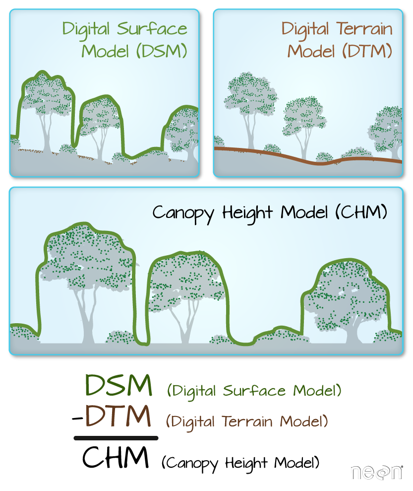
We often want to perform calculations on two or more rasters to create a new output raster. For example, if we are interested in mapping the heights of trees across an entire field site, we might want to calculate the difference between the Digital Surface Model (DSM, tops of trees) and the Digital Terrain Model (DTM, ground level). The resulting dataset is referred to as a Canopy Height Model (CHM) and represents the actual height of trees, buildings, etc. with the influence of ground elevation removed.
More Resources
- Check out more on LiDAR CHM, DTM and DSM in this NEON Data Skills overview tutorial: What is a CHM, DSM and DTM? About Gridded, Raster LiDAR Data.
Load the Data
For this episode, we will use the DTM and DSM from the NEON Harvard Forest Field site and San Joaquin Experimental Range, which we already have loaded from previous episodes.
Exercise
Use the
GDALinfo()function to view information about the DTM and DSM data files. Do the two rasters have the same or different CRSs and resolutions? Do they both have defined minimum and maximum values?Solution
GDALinfo("data/NEON-DS-Airborne-Remote-Sensing/HARV/DTM/HARV_dtmCrop.tif")rows 1367 columns 1697 bands 1 lower left origin.x 731453 lower left origin.y 4712471 res.x 1 res.y 1 ysign -1 oblique.x 0 oblique.y 0 driver GTiff projection +proj=utm +zone=18 +datum=WGS84 +units=m +no_defs file data/NEON-DS-Airborne-Remote-Sensing/HARV/DTM/HARV_dtmCrop.tif apparent band summary: GDType hasNoDataValue NoDataValue blockSize1 blockSize2 1 Float64 TRUE -9999 1 1697 apparent band statistics: Bmin Bmax Bmean Bsd 1 304.56 389.82 344.8979 15.86147 Metadata: AREA_OR_POINT=AreaGDALinfo("data/NEON-DS-Airborne-Remote-Sensing/HARV/DSM/HARV_dsmCrop.tif")rows 1367 columns 1697 bands 1 lower left origin.x 731453 lower left origin.y 4712471 res.x 1 res.y 1 ysign -1 oblique.x 0 oblique.y 0 driver GTiff projection +proj=utm +zone=18 +datum=WGS84 +units=m +no_defs file data/NEON-DS-Airborne-Remote-Sensing/HARV/DSM/HARV_dsmCrop.tif apparent band summary: GDType hasNoDataValue NoDataValue blockSize1 blockSize2 1 Float64 TRUE -9999 1 1697 apparent band statistics: Bmin Bmax Bmean Bsd 1 305.07 416.07 359.8531 17.83169 Metadata: AREA_OR_POINT=Area
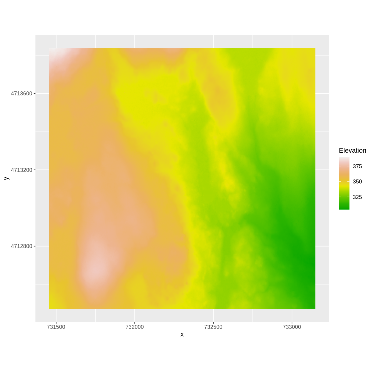
We’ve already loaded and worked with these two data files in earlier episodes. Let’s plot them each once more to remind ourselves what this data looks like. First we’ll plot the DTM elevation data:
 ggplot() +
      geom_raster(data = DTM_HARV_df ,
              aes(x = x, y = y, fill = HARV_dtmCrop)) +
     scale_fill_gradientn(name = "Elevation", colors = terrain.colors(10)) +
     coord_quickmap()
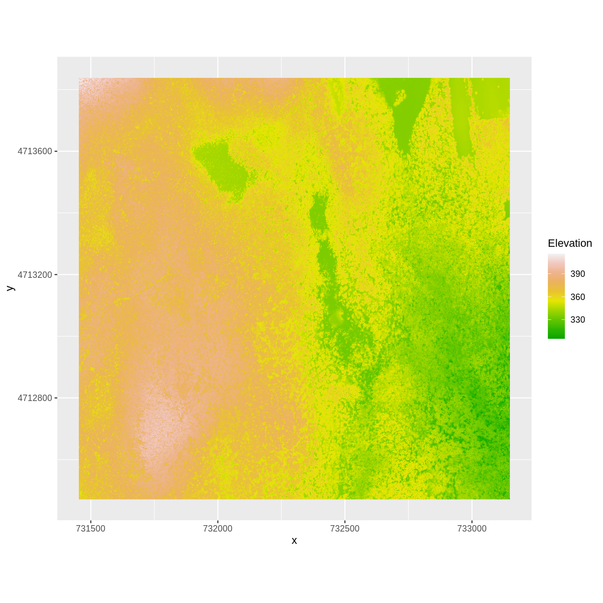
And then the DSM elevation data:
 ggplot() +
      geom_raster(data = DSM_HARV_df ,
              aes(x = x, y = y, fill = HARV_dsmCrop)) +
     scale_fill_gradientn(name = "Elevation", colors = terrain.colors(10)) +
     coord_quickmap()
Two Ways to Perform Raster Calculations
We can calculate the difference between two rasters in two different ways:
- by directly subtracting the two rasters in R using raster math
or for more efficient processing - particularly if our rasters are large and/or the calculations we are performing are complex:
- using the
overlay()function.
Raster Math & Canopy Height Models
We can perform raster calculations by subtracting (or adding, multiplying, etc) two rasters. In the geospatial world, we call this “raster math”.
Let’s subtract the DTM from the DSM to create a Canopy Height Model.
After subtracting, let’s create a dataframe so we can plot with ggplot.
CHM_HARV <- DSM_HARV - DTM_HARV

CHM_HARV_df <- as.data.frame(CHM_HARV, xy = TRUE)
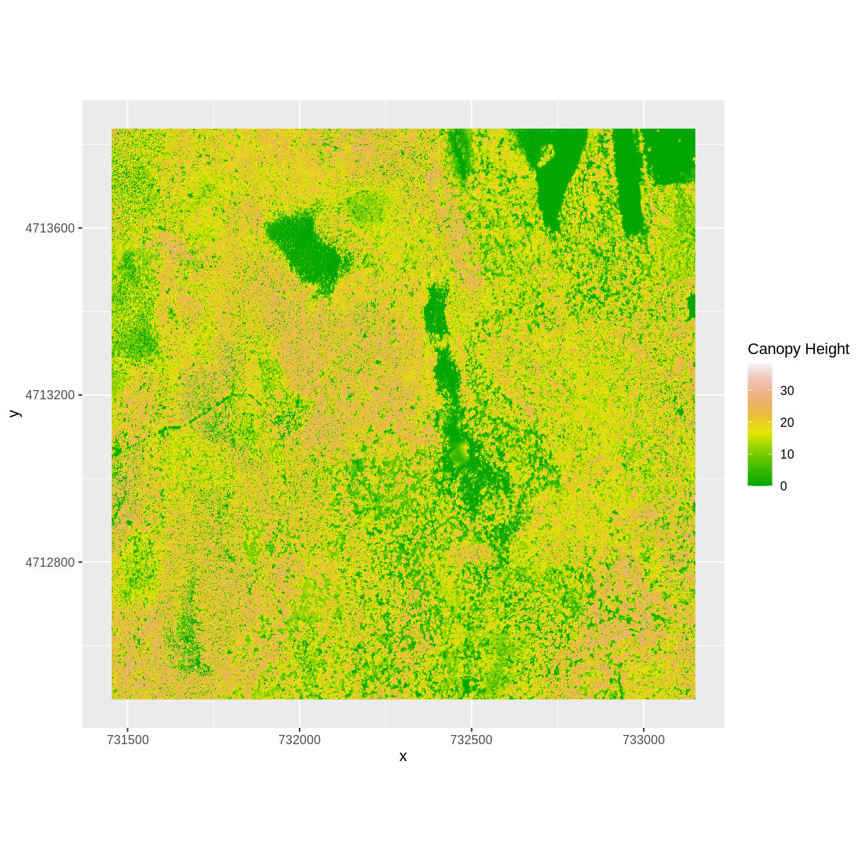
We can now plot the output CHM.
 ggplot() +
   geom_raster(data = CHM_HARV_df ,
               aes(x = x, y = y, fill = layer)) +
   scale_fill_gradientn(name = "Canopy Height", colors = terrain.colors(10)) +
   coord_quickmap()
Let’s have a look at the distribution of values in our newly created Canopy Height Model (CHM).
ggplot(CHM_HARV_df) +
    geom_histogram(aes(layer))
`stat_bin()` using `bins = 30`. Pick better value with `binwidth`.
Warning: Removed 1 rows containing non-finite values (stat_bin).
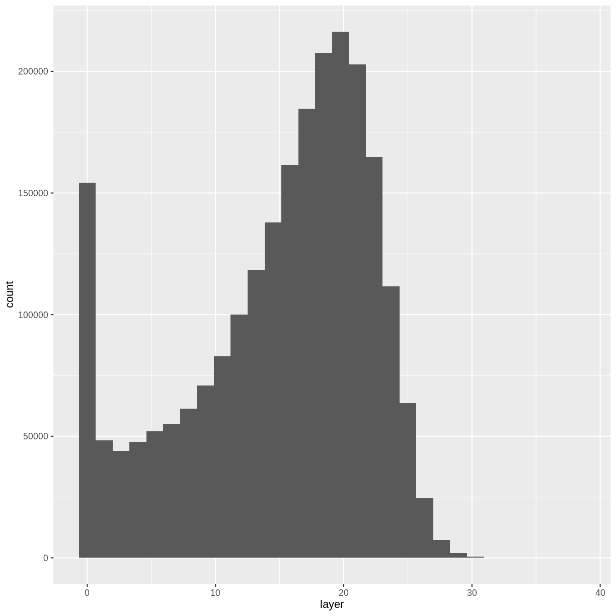
Notice that the range of values for the output CHM is between 0 and 30 meters. Does this make sense for trees in Harvard Forest?
Challenge: Explore CHM Raster Values
It’s often a good idea to explore the range of values in a raster dataset just like we might explore a dataset that we collected in the field.
- What is the min and maximum value for the Harvard Forest Canopy Height Model (
CHM_HARV) that we just created?- What are two ways you can check this range of data for
CHM_HARV?- What is the distribution of all the pixel values in the CHM?
- Plot a histogram with 6 bins instead of the default and change the color of the histogram.
- Plot the
CHM_HARVraster using breaks that make sense for the data. Include an appropriate color palette for the data, plot title and no axes ticks / labels.Answers
1) There are missing values in our data, so we need to specify
na.rm = TRUE.min(CHM_HARV_df$layer, na.rm = TRUE)[1] 0max(CHM_HARV_df$layer, na.rm = TRUE)[1] 38.169982) Possible ways include:
- Create a histogram
- Use the
min()andmax()functions.- Print the object and look at the
valuesattribute. 3)ggplot(CHM_HARV_df) + geom_histogram(aes(layer))`stat_bin()` using `bins = 30`. Pick better value with `binwidth`.Warning: Removed 1 rows containing non-finite values (stat_bin).
4)
ggplot(CHM_HARV_df) + geom_histogram(aes(layer), colour="black", fill="darkgreen", bins = 6)Warning: Removed 1 rows containing non-finite values (stat_bin).
5)
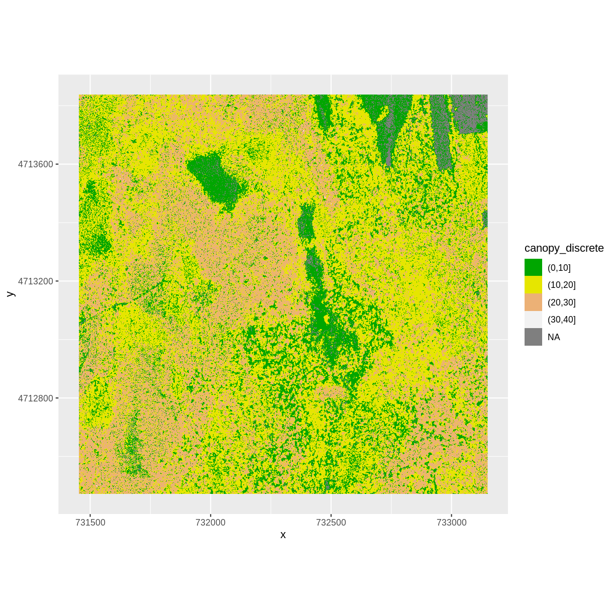
custom_bins <- c(0, 10, 20, 30, 40) CHM_HARV_df <- CHM_HARV_df %>% mutate(canopy_discrete = cut(layer, breaks = custom_bins)) ggplot() + geom_raster(data = CHM_HARV_df , aes(x = x, y = y, fill = canopy_discrete)) + scale_fill_manual(values = terrain.colors(4)) + coord_quickmap()
Efficient Raster Calculations: Overlay Function
Raster math, like we just did, is an appropriate approach to raster calculations if:
- The rasters we are using are small in size.
- The calculations we are performing are simple.
However, raster math is a less efficient approach as computation becomes more
complex or as file sizes become large.
The overlay() function is more efficient when:
- The rasters we are using are larger in size.
- The rasters are stored as individual files.
- The computations performed are complex.
The overlay() function takes two or more rasters and applies a function to
them using efficient processing methods. The syntax is
outputRaster <- overlay(raster1, raster2, fun=functionName)
Data Tip
If the rasters are stacked and stored as
RasterStackorRasterBrickobjects in R, then we should usecalc().overlay()will not work on stacked rasters.
Let’s perform the same subtraction calculation that we calculated above using
raster math, using the overlay() function.
Data Tip
A custom function consists of a defined set of commands performed on a input object. Custom functions are particularly useful for tasks that need to be repeated over and over in the code. A simplified syntax for writing a custom function in R is:
function_name <- function(variable1, variable2) { WhatYouWantDone, WhatToReturn}
CHM_ov_HARV <- overlay(DSM_HARV,
DTM_HARV,
fun = function(r1, r2) { return( r1 - r2) })
Next we need to convert our new object to a data frame for plotting with
ggplot.
CHM_ov_HARV_df <- as.data.frame(CHM_ov_HARV, xy = TRUE)
Now we can plot the CHM:
ggplot() +
geom_raster(data = CHM_ov_HARV_df,
aes(x = x, y = y, fill = layer)) +
scale_fill_gradientn(name = "Canopy Height", colors = terrain.colors(10)) +
coord_quickmap()

How do the plots of the CHM created with manual raster math and the overlay()
function compare?
Export a GeoTIFF
Now that we’ve created a new raster, let’s export the data as a GeoTIFF
file using
the writeRaster() function.
When we write this raster object to a GeoTIFF file we’ll name it
CHM_HARV.tiff. This name allows us to quickly remember both what the data
contains (CHM data) and for where (HARVard Forest). The writeRaster() function
by default writes the output file to your working directory unless you specify a
full file path.
We will specify the output format (“GTiff”), the no data value (NAflag = -9999. We will also tell R to overwrite any data that is already in
a file of the same name.
writeRaster(CHM_ov_HARV, "CHM_HARV.tiff",
format="GTiff",
overwrite=TRUE,
NAflag=-9999)
writeRaster() Options
The function arguments that we used above include:
- format: specify that the format will be
GTiffor GeoTIFF. - overwrite: If TRUE, R will overwrite any existing file with the same name in the specified directory. USE THIS SETTING WITH CAUTION!
- NAflag: set the GeoTIFF tag for
NoDataValueto -9999, the National Ecological Observatory Network’s (NEON) standardNoDataValue.
Challenge: Explore the NEON San Joaquin Experimental Range Field Site
Data are often more interesting and powerful when we compare them across various locations. Let’s compare some data collected over Harvard Forest to data collected in Southern California. The NEON San Joaquin Experimental Range (SJER) field site located in Southern California has a very different ecosystem and climate than the NEON Harvard Forest Field Site in Massachusetts.
Import the SJER DSM and DTM raster files and create a Canopy Height Model. Then compare the two sites. Be sure to name your R objects and outputs carefully, as follows: objectType_SJER (e.g.
DSM_SJER). This will help you keep track of data from different sites!
- You should have the DSM and DTM data for the SJER site already loaded from the Plot Raster Data in R episode.) Don’t forget to check the CRSs and units of the data.
- Create a CHM from the two raster layers and check to make sure the data are what you expect.
- Plot the CHM from SJER.
- Export the SJER CHM as a GeoTIFF.
- Compare the vegetation structure of the Harvard Forest and San Joaquin Experimental Range.
Answers
1) Use the
overlay()function to subtract the two rasters & create the CHM.CHM_ov_SJER <- overlay(DSM_SJER, DTM_SJER, fun = function(r1, r2){ return(r1 - r2) })Convert the output to a dataframe:
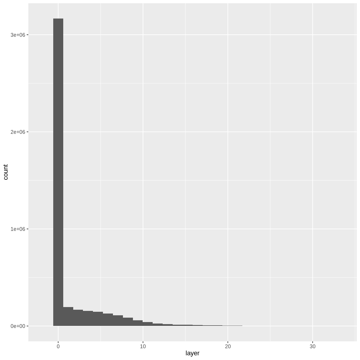
CHM_ov_SJER_df <- as.data.frame(CHM_ov_SJER, xy = TRUE)Create a histogram to check that the data distribution makes sense:
ggplot(CHM_ov_SJER_df) + geom_histogram(aes(layer))`stat_bin()` using `bins = 30`. Pick better value with `binwidth`.
2) Create a plot of the CHM:
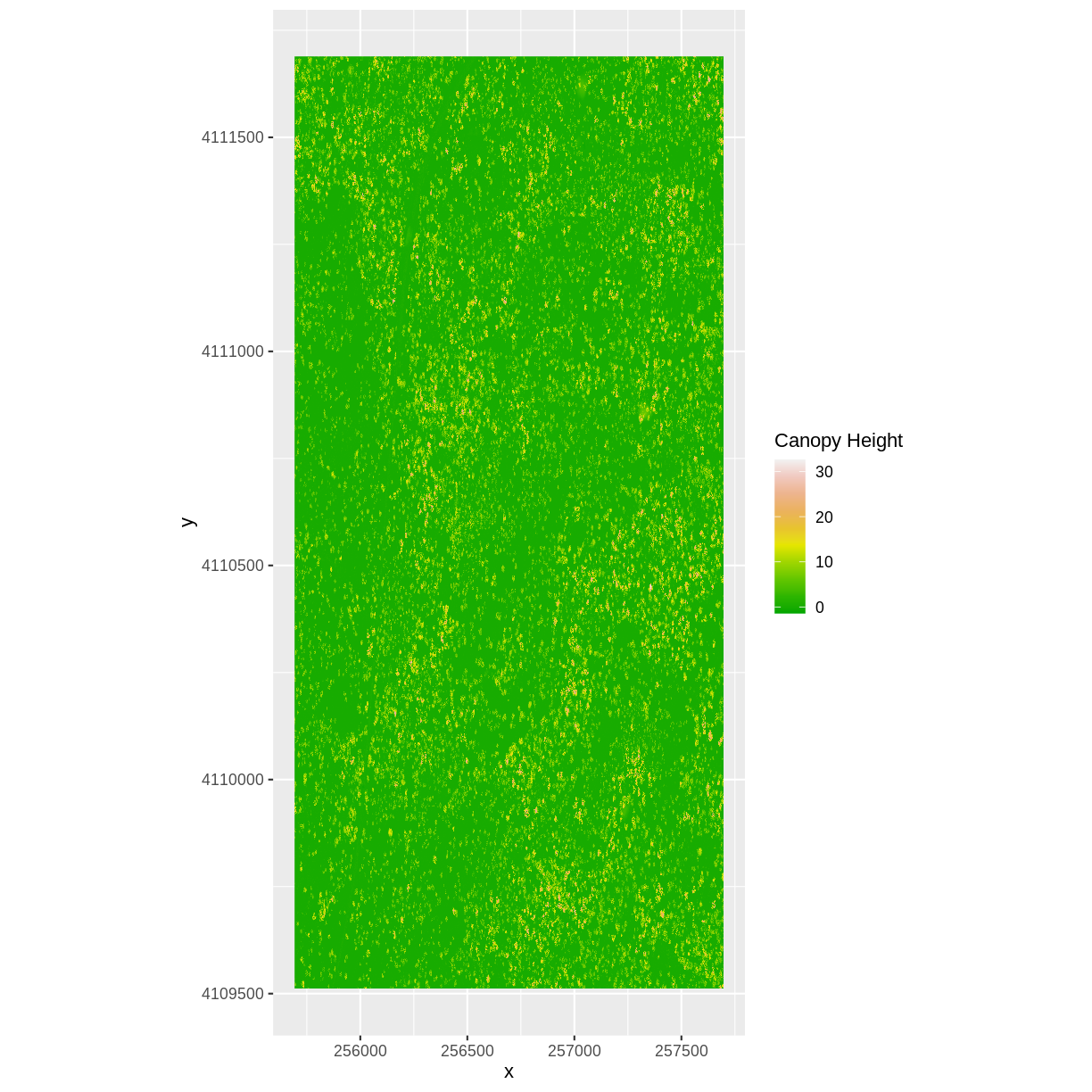
ggplot() + geom_raster(data = CHM_ov_SJER_df, aes(x = x, y = y, fill = layer) ) + scale_fill_gradientn(name = "Canopy Height", colors = terrain.colors(10)) + coord_quickmap()
3) Export the CHM object to a file:
writeRaster(CHM_ov_SJER, "chm_ov_SJER.tiff", format = "GTiff", overwrite = TRUE, NAflag = -9999)4) Compare the SJER and HARV CHMs. Tree heights are much shorter in SJER. You can confirm this by looking at the histograms of the two CHMs.
ggplot(CHM_HARV_df) +
    geom_histogram(aes(layer))
`stat_bin()` using `bins = 30`. Pick better value with `binwidth`.Warning: Removed 1 rows containing non-finite values (stat_bin).
ggplot(CHM_ov_SJER_df) +
    geom_histogram(aes(layer))
`stat_bin()` using `bins = 30`. Pick better value with `binwidth`.
Key Points
Rasters can be computed on using mathematical functions.
The
overlay()function provides an efficient way to do raster math.The
writeRaster()function can be used to write raster data to a file.
