Introduction to Visualization
Overview
Teaching: 20 min
Exercises: 15 minQuestions
What are the basics of creating graphics in R?
Objectives
To be able to use ggplot2 to generate histograms and bar plots.
To apply geometry and aesthetic layers to a ggplot plot.
To manipulate the aesthetics of a plot using different colors and position parameters.
Plotting our data is one of the best ways to quickly explore it and the various relationships between variables. There are three main plotting systems in R, the base plotting system, the lattice package, and the ggplot2 package. Today and tomorrow we’ll be learning about the ggplot2 package, because it is the most effective for creating publication quality graphics. In this episode, we will introduce the key features of a ggplot and make a few example plots. We will expand on these concepts and see how they apply to geospatial data types when we start working with geospatial data in the R for Raster and Vector Data lesson.
ggplot2 is built on the grammar of graphics, the idea that any plot can be expressed from the same set of components: a data set, a coordinate system, and a set of geoms–the visual representation of data points. The key to understanding ggplot2 is thinking about a figure in layers. This idea may be familiar to you if you have used image editing programs like Photoshop, Illustrator, or Inkscape. In this episode we will focus on two geoms
- histograms and bar plot. In the R for Raster and Vector Data lesson we will work with a number of other geometries and learn how to customize our plots.
Let’s start off with an example plotting the
distribution of life expectancy in our dataset. The first thing we do is call the ggplot function. This function lets R
know that we’re creating a new plot, and any of the arguments we give the
ggplot() function are the global options for the plot: they apply to all
layers on the plot.
We will pass in two arguments to ggplot. First, we tell
ggplot what data we
want to show on our figure, in this example we use the gapminder data we read in
earlier. For the second argument we pass in the aes() function, which
tells ggplot how variables in the data map to aesthetic properties of
the figure. Here we will tell ggplot we
want to plot the “lifeExp” column of the gapminder data frame on the x-axis. We don’t need to specify a y-axis
for histograms.
library("ggplot2")
ggplot(data = gapminder, aes(x = lifeExp)) +
  geom_histogram()

By itself, the call to ggplot isn’t enough to draw a figure:
ggplot(data = gapminder, aes(x = lifeExp))
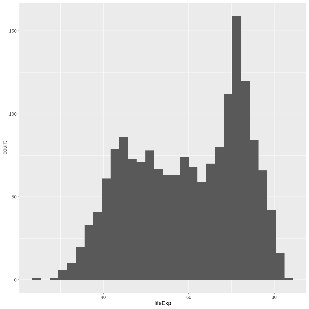
We need to tell ggplot how we want to visually represent the data, which we
do by adding a geom layer. In our example, we used geom_histogram(), which
tells ggplot we want to visually represent the
distribution of one variable (in our case “lifeExp”):
ggplot(data = gapminder, aes(x = lifeExp)) +
  geom_histogram()
`stat_bin()` using `bins = 30`. Pick better value with `binwidth`.
Challenge 1
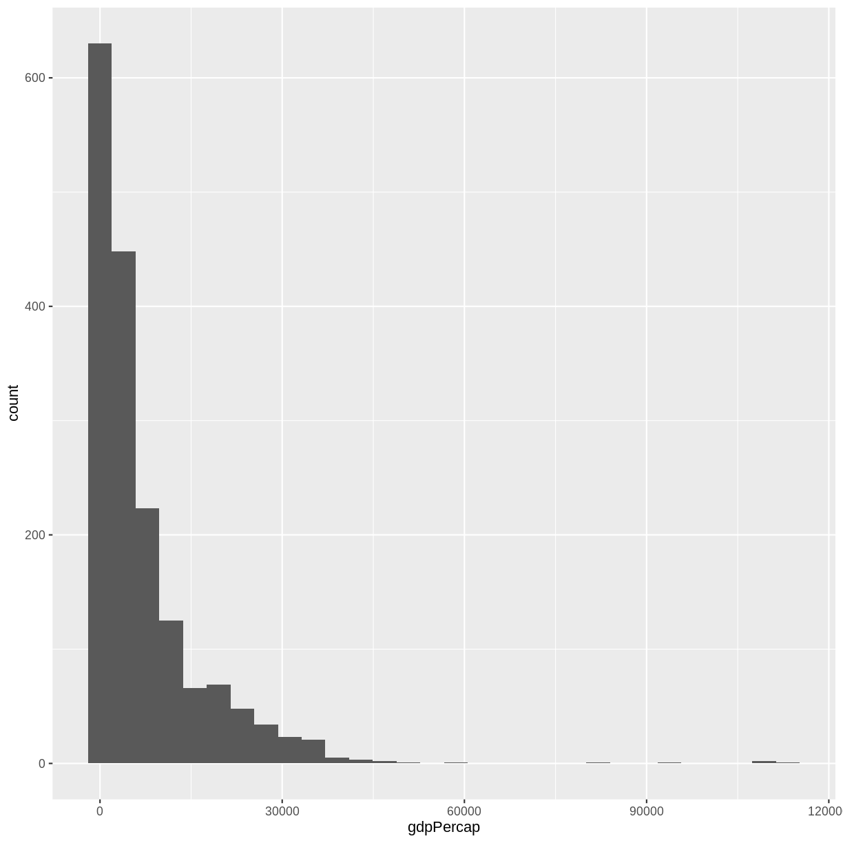
Modify the example so that the figure shows the distribution of gdp per capita, rather than life expectancy:
Solution to challenge 1
ggplot(data = gapminder, aes(x = gdpPercap)) +
  geom_histogram()
`stat_bin()` using `bins = 30`. Pick better value with `binwidth`.
The histogram is a useful tool for visualizing the distribution of a single categorical variable. What if we want to compare the gdp per capita of the countries in our dataset? We can use a bar (or column) plot. To simplify our plot, let’s look at data only from the most recent year and only from countries in the Americas.
gapminder_small <- filter(gapminder, year == 2007, continent == "Americas")
This time, we will use the geom_col() function as our geometry.
We will plot countries on the x-axis (listed in alphabetic order
by default) and gdp per capita on the y-axis.
ggplot(data = gapminder_small, aes(x = country, y = gdpPercap)) +
  geom_col()
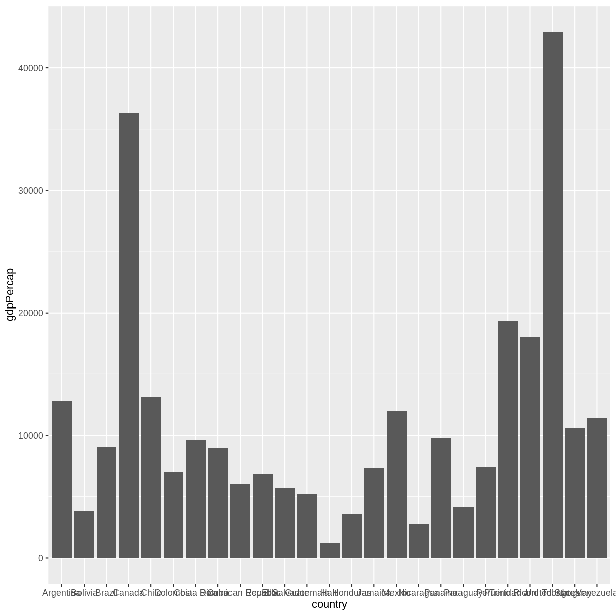
With this many bars plotted, it’s impossible to read all of the
x-axis labels. A quick fix to this is the add the coord_flip()
function to the end of our plot code.
ggplot(data = gapminder_small, aes(x = country, y = gdpPercap)) +
  geom_col() +
  coord_flip()
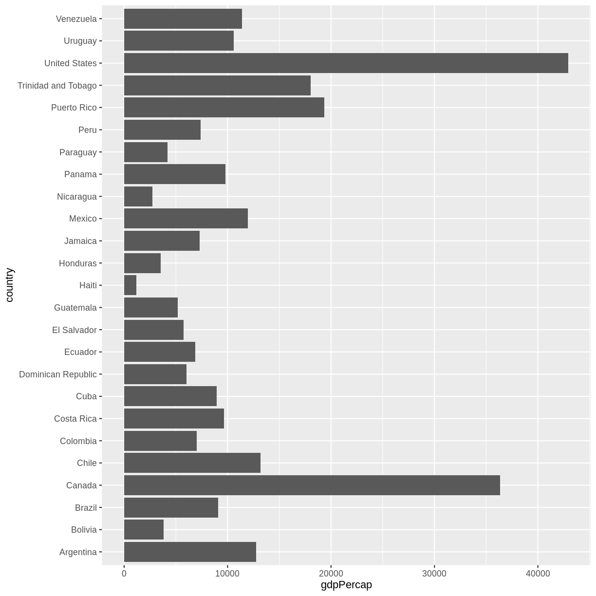
There are more sophisticated ways of modifying axis labels. We will be learning some of those methods later in this workshop.
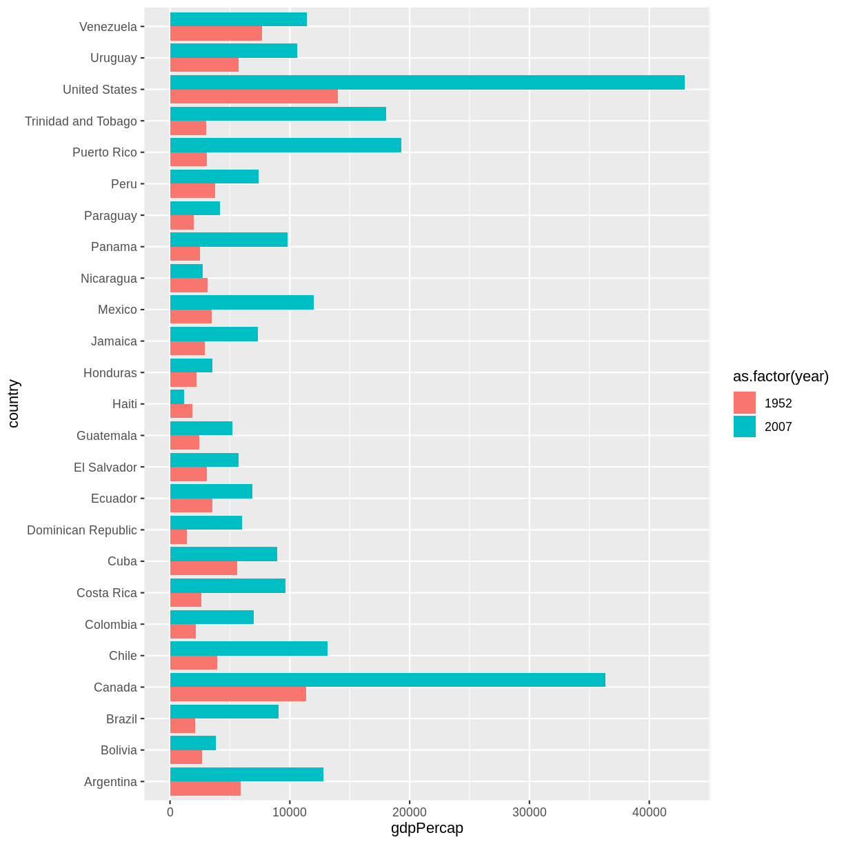
Challenge 2
In the previous examples and challenge we’ve used the
aesfunction to tell thegeom_histogram()andgeom_col()functions which columns of the data set to plot. Another aesthetic property we can modify is the color. Create a new bar (column) plot showing the gdp per capita of all countries in the Americas for the years 1952 and 2007, color coded by year.Solution to challenge 2
First we create a new object with our filtered data:
gapminder_small_2 <- gapminder %>%
                        filter(continent == "Americas",
                               year %in% c(1952, 2007))
Then we plot that data using the
geom_col()geom function. We color bars using thefillparameter within theaes()function. Since there are multiple bars for each country, we use thepositionparameter to “dodge” them so they appear side-by-side. The default behavior forpostioningeom_col()is “stack”.ggplot(gapminder_small_2, aes(x = country, y = gdpPercap, fill = as.factor(year))) + geom_col(position = "dodge") + coord_flip()
The examples given here are just the start of creating complex and beautiful graphics with R. In a later lesson we will go into much more depth, including:
- plotting geospatial specific data types
- adjusting the color scheme of our plots
- setting and formatting plot titles, subtitles, and axis labels
- creating multi-panel plots
- creating point (scatter) and line plots
- layering datasets to create multi-layered plots
- creating and customizing a plot legend
- and much more!
The examples we’ve worked through in this episode should give you the building blocks for working with the more complex graphic types and customizations we will be working with in that lesson.
Key Points
Use
ggplot2to create plots.Think about graphics in layers: aesthetics, geometry, etc.
